Sunday 14 November 2010

Finals and Mounting

Here are my final images I will be submitting, I have a mixture of some with a person in the image, and some without.
These are the finished edited images.
Flyers on the table. Added contrast, burned round the edges.
 Liked the above image simply because it's abstract on what is visible, yet it does show a person in it, but the sunglasses cover their face.


Giant pink cup. Cloned out the bag on the left of the image so it looked more symmetrical, burned in round the edges, added a small amount of contrast because it didn't need alot due to the vibrancy of the pink glass.
Love the pink glass photo because I hardly had to edit the colours or vibrancy of the photo at all, I think because the light is very bright shining through the window which has reflected onto the glass and the table, making it look slightly ghostly because of all the light patches dotted around the table.


Ketchup and clingfilm. Burned around the edges, added contrast.
 I like how the kecthup bottle frames the photo and draws in your attention, Again, only the bottom half of the model's face is visible, making it less personal, and making her have less of an 'identity'. 


The kitchen sink. Again, burned round the edges to draw in focus, cropped the image slightly so the model was centre.
 I like the angle and perspective of the above image, and that I have de-personalised the model by only showing her legs and feet. 


Water glass. Added contrast, burned in edges.
 The above image is my favourite out of them all, because I like the fact that even though you can see the model's face, you can't see her eyes, which has made it less personal, and I think this is because people's eyes show alot of emotion and feelings. Also love the perspective of this image, I wanted the glass to be off-centre, as I think it draws you into the back of the photo where the model is


     Murky pot. Cloned out the knife because it was distracting, added contrast.       
 Love this image because it is murky and mysterious, and the water is dirty so you can't really see what's in the pan.

I have now printed my images using photo glossy paper on my own printer in my uni room, (I was slightly anxious as to how they'd turn out because I haven't used photo paper before in that printer) and they have come out very well, and to a high quality which is good!! I then mounted them onto thick black card using double-sided tape (much better than glue which can make pictures soggy and is more messy) and have written my name on the back of each photo.

Scanned images

Here are some scanned images of pages from the book 'Unseen Vogue'which has a selection of photos, letters, contact sheets and test strips which have never been published in Vogue, or available to the public before.
'Weekend in Brussells' 1947 Norman Parkinson
  Love this series of photos going on and coming off the plane, reminds me of the photo sequences by Duane Michals I posted before. Even though some of the photos seem posed, the poses are relaxed and natural. The photos have an element of surveillance in them, as it appears the photographer has bent down to take photos from underneath the plane, and also behind the wing, as well as behind a tree in the top left photo which acts as a cover but also frames the inset detail, drawing in attention.

Images of Jean Shrimpton, 1962 David Bailey

   
Quote from the page writing "documentary realism that Bailey seldom used again for fashion reporting" "assemblages of a street vernacular: billboard signs, discarded bottle tops, advertising hoardings, shop fronts, road signs and cinema posters ." 
Street photography style photos, the smoke in the right photo disguises some of the model, making it seem more casual and less 'perfect'. 


Fashion Photographs, 1986 Steven Meisel, on location in New York

The billboard in the left photo is covering the models face, exposing only her legs and feet. 
The right photo is more posed and her whole body is exposed, which gives the photo a different dimension, because she has more of an identity because we can see her face.

Rosemary Ferguson and Cecilia Chancellor, 1993, Corinne Day
Quote from the page "her prints were likened to stills from a gritty documentary or freeze frames from a home movie. Whatever they were, they tried hard not to be fashion photographs, attempting to be natural and without 'style'."

The photo on the left is quite bleached out and monotone, there is no detail in the sky, and the feel of it is quite 'moody'. Also it's an interesting crop, because the bike is visible behind right, why has it not been cropped out? Maybe to add more detail in the background and to add another dimension to the photo, because the perspective is quite interesting because it appears on a tilt, then you see the cyclist, and then the uniform houses in the background. Also the model's black skirt, and the cyclist stand out because they are darker in tone.
The photo on the right is more casual, and has more things going on the background, it appears less posed and more in the moment, and again the terrain appears on a tilt, as if the model is going up hill. 

Friday 12 November 2010

More research!!

Here are a few more photographers that are interesting and link in well with my project.

Donald Christie
I like the above images taken by Donald Christie because they are very 'photojournalism style' photos. They have been taken very quickly and 'in the moment' as the situation is happening before his eyes. 
I like the photo of the un-opened waterlily as it reminds me of the photo I took of the spoon and pan left in the kitchen sink, which I liked because the water looked mysterious and murky, similar to the water the lily is floating in.


Frank Lee
I love the amount of different patterns and shapes there are in this photo, the curves against the strong zig-zag lines.
Again, the patterns and shapes are very interesting and are very contrasting, for instance the circular mirror against the straight wall.
Love the perspective of this photo, it looks like a vortex that you might get sucked into!
I love the fact that this image has alot of symmetry, for instance the two men are standing face to face in the centre of the photo, without realising. 

 I love love love Frank Lee's photos, especially the group of photos taken in the London underground, some of which I have posted above from his website. All of them are black&white which enhances the contrast and tone in each image, especially because the underground is full of different patterns, shapes, levels and symmetry. The lighting is also very particular in each image, adding to the symmetry and shape. For instance the first photo I have posted of Frank Lee's work above, has very soft ceiling lighting, which contrasts with the strong, robust shapes of the walls and the stairs.
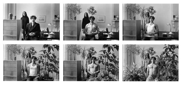

Duane Michals  
 I really like Duane Michals' photo sequences, because they are documenting certain scenes, yet are set-up too, so are not photos necessarily 'in the moment.' However they document an episode of time frame by frame, rather than just in one photo, making them fun and interesting to look at because you see the scene unravelling before your eyes. 


Henri Cartier-Bresson

French photographer famous for his street photography.
Above is a great shot by famous photographer Henri Cartier-Bresson. It's a street photo which was taken just at the right time, which couldn't have been easily photographed again. There's an element of 'luck' in documentary and street photography because if a photographer is a second late at taking a shot, it might be too late, and no longer the perfect shot. 
That's why it's important for me to have my camera on me as much as possible to take photos of things which might not still be there a day, or even a couple of minutes or seconds later.


Arthur Fellig  (Weegee)
Lovers in the movies.
Above is a great 'street' photo taken in the cinema by photographer Arthur Fellig. This photo shows elements of surveillance and documenting because the couple appear unaware that the photo was being taken.

Thursday 11 November 2010

Editing

Here are some photos I took the other day, but I have edited them to enhance them and make them look more polished. I have 'print-screened' a few techniques I have used on Photoshop to show what techniques were used.
Original photo
Above, a print screen of photoshop, using the clone stamp tool to get rid of the knife which is distracting.
Here is the final image, I increased the contrast, and burned in the corners to bring in the focus too.


Here is another image I have edited on Photoshop, that I particularly like as a 'Final'.
Original image
Above, a print screen image from Photoshop, using the curves tool, and adjusting the contrast as well.
 Above, a print screen image from Photoshop, using the burn tool to draw in focus towards the glass, and to act as a 'frame'


Here is the final image after editing. 


 Here is another photo that I took which I really like, it's already looks like it has had some editing done to it, but I haven't changed it at all. I might crop it, and enhance it slightly.

Above is a screenprint of photoshop, showing the 'clone stamp' tool being used- to remove the blue bag on the left hand side of the photo which was distracting.


 Above is the finished edited image. I got rid of the blue bag, and cropped down the image, just slightly to draw in focus. I added some contrast, changed the curve levels and burned in the corners.

Above is a desaturated version of the edited photo, just to compare whether or not I prefer it in black&white or in colour.


Between the 2 photos above, I think I prefer the colour version because the pink glass is very vibrant and eye-catching, and acts as a focal point to the photo, where as in the black&white version you lose that vibrancy. One of my favourite tools on Photoshop is the clone stamp tool, (which I have been using alot of!) which 'clones' certain areas of your photo so you can remove things that are distracting and unnecessary. It is also a very effective tool when used on photos of people, because you can remove blemishes on their skin and any other marks to make the skin look flawless.

Wednesday 10 November 2010

More research

I remember visiting an exhibition a couple of years ago at the Tate Modern called 'Street and Studio' which looked at photography taken on the streets or in the photographer's studio. The exhibition showed the contrasts between the studio, where everything is planned and positioned, and on the street, where there is movement and unpredictable things going on all the time.

http://www.tate.org.uk/modern/exhibitions/streetandstudio/default.shtm
Banksy is also another artist who uses the ideas of 'exposure'

 I think Banksy's work is clever because it's effectively 'mocking' and exploiting what is seen as 'PC' in our country. Especially because his work is done in secret, yet the results are so prominent and public. 

 The above piece of work by Banksy is interesting because it exploits the idea that we're all guilty until proven innocent, even children. 

more photos

Here are some more photos I have taken of my flatmate in a 'documentary' style. I wanted to include someone in the photos, even if it's just a glimpse of a hand, or hair etc, because it makes it look more like I'm documenting someone rather than just random objects. It also means the photos have more of a story, and link together as a group of images.